Jane McIntyre

Twitter

Follow me on Twitter:
@janemcintyre12 | @normandycottage

JanePic

Hello.

I'm Jane McIntyre, a Sony-winning BBC producer who asked to take the money and run. Now running, daily, and er... spending the money. Also, writing (recently runner-up in LateRooms travel blog competition) and working regularly as an 'extra' in TV, commercials and movies. Hurrah!

Tuesday 31 May 2011

Your caring, sharing Co-op


When The Co-op rebranded as The Co-operative back in 2007, their strong (although not perfect), contemporary, new identity was successfully applied across all divisions of the group, and on a smaller scale, across all types of own-brand food packaging. The latter was especially impressive - each item of packaging would follow the same, strict corporate guidelines, with type and layout remaining consistent throughout, only the colour-ways changing from the value to the mid-range to the high-end products.

McCann Erikson of London were responsible for the rebranding, but gradually their work has been diluted. Firstly, The Co-operative's purchase of Somerfield saw the 'The Co-op' inexplicably ditch their family-look Everyday range, in favour of Somerfield's clumsily-titled Simply Value range. Now, Manchester's GJ Creative have tinkered with the Truly Irresistible range (another naff name), helping to produce a now confused-looking food portfolio.

The Co-operative needed to tweak the flavour, quality and pricing of its food. Not the packaging.

And we just couldn't resist the nostalgic inclusion of the Co-op slogan and logo from the 1970s. Memories!

Thursday 26 May 2011

Focus a little blurred

Sad to see the 'closing down' signs go up at my local DIY store - Focus in Chard. Seemed to spend half of my life in there when I bought my house in Axminster five-or-so years' ago.

So, why has the Focus chain failed?

Off the top of my head, three things spring to mind:

1. A failure to adapt to the changing world of DIY, as B&Q and Homebase have done, by offering a wider and more contemporary range of homeware and soft furnishings.

2. The wishy-washy name. Think the 'Do It All' brand, from their own back catalogue, is ballsier.

3. The colour scheme. That dark blue always looked drab, whether on uniforms or signage. The yellow and blue would've looked much brighter and stronger reversed, with a nice, bright yellow as the main background colour.

Let's hope the staff get fixed up with alternative employment very soon.

Friday 13 May 2011

With my little eye


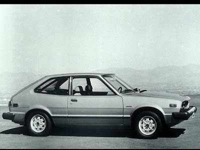
How many I-Spy points for these? Over the last few days, I’ve seen an immaculate Mk I Honda Accord in Poole, a Talbot Sunbeam Lotus in Bridport, a Commer camper van on the way to Exeter (which reminded me that I used to want one - I now want one again) and a Renault Fuego in Weymouth. When was the last time ANYONE saw a Renault Fuego?!

I had a look on eBay to see how many Mk I Accords, Sunbeam Lotuses, Commer Campers and Fuegos there were available. Only three. Surprisingly, all Commers.

Wonder how much is in my PayPal account?